
Modernize Your Talent Assessments and Analytics
Transform competency assessments with engaging 360° feedback, real-time dashboards, and ROI-focused analytics to drive growth and accountability.

Competency Framework Gallery
At the heart of effective talent assessment is a solid competency framework. We help you move from outdated or one-size-fits-all models to modern, tailored frameworks that reflect your organization’s needs. Our Competency Framework Gallery is a curated collection of proven models and customizable templates.
What does this mean in practice? Suppose your leadership development program currently uses a generic set of competencies from a decade ago. We might suggest a refreshed framework emphasizing modern skills (e.g. Agility, Inclusive Leadership, Digital Literacy) alongside core management skills. Our gallery provides examples from various industries and roles: from sales competencies (like Consultative Selling, Customer Empathy) to tech team competencies (like Innovation, Collaboration, Coding Excellence), to leadership pathways. Each framework in the gallery comes with definitions and behavioral indicators. For instance, “Customer Empathy” might be defined with behaviors like “actively listens to client needs without interrupting”.
We don’t just hand over a catalog – we work with your HR/L&D stakeholders to pick and adapt the right competencies. This could involve workshops with your subject matter experts to validate which competencies correlate with success in specific roles. Often, we’ll co-create a custom competency model by selecting from the gallery and adding any unique ones for your culture. The result is a competency framework that employees actually recognize and find relevant, rather than abstract HR jargon.
To bring the framework to life, we also showcase a “gallery” of how competencies can be visualized and used. For example, we might display a competency profile card for an employee: a radar chart or bar chart showing their self-assessed vs peer-assessed ratings on each competency. (Our modernization includes introducing such visuals.) We highlight that modern frameworks aren’t static lists – they tie into the assessment platform, enabling features like personalized development tips per competency or grouping employees by strengths. By selecting the right competencies and structuring them well (often in tiers like core vs leadership competencies), we set the foundation for all your assessments and analytics to come.
In short, the Competency Framework Gallery accelerates the process of updating your models. You benefit from industry best practices and research-backed competencies, instead of starting from scratch. A strong, relevant framework ensures that subsequent 360° surveys or analytics truly measure what matters – the behaviors and skills that drive performance in your organization.
360°/Peer Feedback Flowchart
Traditional performance reviews often give a narrow view. We modernize your approach with 360-degree feedback (also known as multi-rater assessments) to gather well-rounded input. To demystify this process for everyone, we provide a 360° feedback flowchart that illustrates each step in a transparent way.
What does the flowchart show? It starts with Select Raters: the employee (subject of the feedback) and their manager choose a circle of reviewers – typically including peers, direct reports (for managers), and sometimes internal customers or clients. Next is Feedback Collection: all raters, plus the individual for self-assessment, receive a questionnaire based on the competencies. We ensure the questions are behavior-based (e.g. “Demonstrates active listening in team meetings” rather than vague traits). The flowchart shows parallel streams of feedback coming in from these different sources, converging into a central point – the system that compiles the data.
After that comes Report Generation: our modern assessment platform automatically aggregates the ratings and comments. Visuals like bar charts compare self vs others on each behavior, and highlight where perceptions align or differ (e.g. the individual rated themselves high on “Collaboration” but peers rated lower – a potential blind spot). The flowchart indicates a “consolidated feedback report” ready for review.
Finally, Debrief and Action Planning: The flow moves to a meeting between the individual and their manager (and/or a coach) to discuss the feedback. Here, strengths are acknowledged and development areas are identified. Crucially, the flowchart ends with an Action Plan box – emphasizing that the outcome of 360 isn’t just a report, but a set of agreed next steps (training, coaching, new goals).
Throughout the diagram, we include checkpoints for confidentiality and anonymity, since peer feedback must be candid. We illustrate, for example, that individual peer responses are anonymized in the report (peers’ scores are averaged, comments are not attributed by name). We also embed best practices: the flowchart notes that feedback should be given 360° every 6 or 12 months (not just a one-off), and that it’s developmental (not directly tied to compensation decisions, to encourage honesty).
The benefit of using this flowchart with your team is clarity. It shows how we move from collecting inputs from all around an employee to actionable insights. This process yields a “more objective evaluation system with reduced bias and greater emphasis on development” compared to the old top-down review. Research backs this up: organizations that adopt regular feedback cycles see improved performance and lower turnover – one study found employees receiving ongoing feedback had 15.9% better retention than those who didn’t.
By laying out the 360° process visually, we ensure everyone understands their role (whether as a rater or recipient) and the value of each step. It demystifies multi-rater feedback and builds trust in the process. Once people see the fair and thorough nature of 360s, they become more open to giving and receiving feedback – which is exactly the cultural shift we aim for. Together with a solid competency framework, the 360° flow forms the backbone of a modern, growth-oriented performance development system.
What does this mean in practice? Suppose your leadership development program currently uses a generic set of competencies from a decade ago. We might suggest a refreshed framework emphasizing modern skills (e.g. Agility, Inclusive Leadership, Digital Literacy) alongside core management skills. Our gallery provides examples from various industries and roles: from sales competencies (like Consultative Selling, Customer Empathy) to tech team competencies (like Innovation, Collaboration, Coding Excellence), to leadership pathways. Each framework in the gallery comes with definitions and behavioral indicators. For instance, “Customer Empathy” might be defined with behaviors like “actively listens to client needs without interrupting”.
We don’t just hand over a catalog – we work with your HR/L&D stakeholders to pick and adapt the right competencies. This could involve workshops with your subject matter experts to validate which competencies correlate with success in specific roles. Often, we’ll co-create a custom competency model by selecting from the gallery and adding any unique ones for your culture. The result is a competency framework that employees actually recognize and find relevant, rather than abstract HR jargon.
To bring the framework to life, we also showcase a “gallery” of how competencies can be visualized and used. For example, we might display a competency profile card for an employee: a radar chart or bar chart showing their self-assessed vs peer-assessed ratings on each competency. (Our modernization includes introducing such visuals.) We highlight that modern frameworks aren’t static lists – they tie into the assessment platform, enabling features like personalized development tips per competency or grouping employees by strengths. By selecting the right competencies and structuring them well (often in tiers like core vs leadership competencies), we set the foundation for all your assessments and analytics to come.
In short, the Competency Framework Gallery accelerates the process of updating your models. You benefit from industry best practices and research-backed competencies, instead of starting from scratch. A strong, relevant framework ensures that subsequent 360° surveys or analytics truly measure what matters – the behaviors and skills that drive performance in your organization.
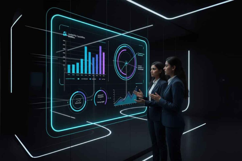
Dashboard Screenshots
Data is only useful if it’s accessible and actionable. As part of our modernization, we deliver interactive dashboards that turn assessment data into insights at a glance. We’ll provide sample dashboard screenshots (or live demos) so you know what to expect. Here are some of the game-changing analytics views you’ll gain:
Individual Profile Dashboard
A one-page snapshot for each employee that visualizes their feedback results. For example, a radar chart might display the person’s self-score vs. peer average across all competencies. This provides an “instant view of gaps and consensus” – you can quickly spot where self-perception and others’ perceptions diverge. The screenshot shows, say, Communication, Teamwork, Strategic Thinking, etc., with sections where the self-line sticks out (overestimation) or dips in (underestimation). Highlighted notes call out top strengths (areas where self and peers agree the person excels) and blind spots (areas of overestimation). This visual makes feedback digestible and helps in coaching conversations.


Team Heatmap & Leaderboard
We modernize team-level analytics too. One screenshot example is a competency heatmap for a team or department. Each row is a competency, each column is a team member, and the cells are color-coded (e.g. red = low, green = high proficiency). At a glance, managers can “spot role models and gaps fast — target coaching or peer mentoring where needed”. Next to it might be a leaderboard listing team members with the highest scores in certain areas. For instance, the dashboard might show that Alice and Bob score high in Innovation (so they could mentor others), while Competency X has an overall low score across the team (indicating a training need). This encourages a healthy, data-driven approach to development – it’s not about ranking for rewards, but identifying who can help whom and which skills need attention.
Organizational Insights
For HR and L&D leaders, we provide higher-level analytics. Imagine a dashboard of competency gaps across the whole organization or specific cohorts. One screenshot might depict a bar graph of average scores for each competency for, say, Mid-level Managers versus Industry Benchmarks or versus Last Year’s scores. This helps answer strategic questions: Are we improving our leadership capabilities? Which critical skills are lagging behind? We also set up ROI indicators – for example, correlating improvement in competencies with business KPIs. A chart could show that teams who improved in “Customer Focus” competency by one performance band saw a corresponding increase in customer satisfaction scores. Another widget might track participation rates in assessments and subsequent training uptake, linking usage of the system to outcomes.
All our dashboards are built on a modern BI tool embedded in the platform, meaning you can filter and drill down (the screenshots are just a starting point). They are also mobile-friendly for on-the-go access. Perhaps most importantly, they promote a culture of transparency and accountability. When leaders and employees can see real data on soft skills and behaviors – traditionally “fuzzy” areas – it drives action. Managers start having richer conversations (“I see our team’s lowest area is XYZ, let’s focus our next team development on that”) and individuals feel empowered to track their growth.
One standout visual we include is the Alignment Radar mentioned earlier, which compares self vs peer across behaviors for a team or individual. It’s often a favorite because it quickly highlights over-confidence or hidden strengths. Another is the High-Medium-Low distribution matrix: placing people or teams in color-coded categories, which can be great for talent reviews (e.g. seeing which teams are high on both Interpersonal and Intrapersonal competencies versus needing help in one).
By providing these screenshot examples during our project, we ensure you know what’s coming and can tailor the visuals to what matters most. Perhaps you care more about trends over time – we can emphasize a time-series graph. Or maybe a certain competency (like Safety in a manufacturing firm) is mission-critical – we’ll make sure it’s front and center in the reports. The ultimate goal is that, with our modern analytics, you’re not just collecting data for the sake of it. You’re getting actionable intelligence. As one of our clients put it, the new dashboards allowed them to go from “data-rich but insight-poor” to truly leveraging feedback data to drive decisions on training, promotions, and more.
ROI Calculator
Training and assessment initiatives often face the challenge of proving their value. That’s why we provide an ROI Calculator as part of our solution – to quantitatively demonstrate the return on investing in modern assessments and analytics. This isn’t a generic spreadsheet; it’s a tailored tool (widget on the website or a simple app) where you can input your own data and assumptions to project outcomes.
How does it work? The ROI Calculator typically asks for a few key inputs: number of employees undergoing the new assessment program, average salary or productivity value per employee, current turnover or performance metrics, etc. Then it applies evidence-based estimates of improvement driven by better assessments. For example, research might show that organizations with strong feedback cultures have X% lower turnover. If you input that you have 500 employees with a 15% annual turnover, and we expect a modest improvement to 13% turnover after a year of our program (due to employees feeling more heard and developed), the calculator will output the cost savings from retaining those extra employees (avoiding re-hiring costs, etc.). Similarly, we plug in metrics for productivity: say improved manager competencies lead to higher team productivity or sales; the tool can estimate the dollar impact of a 5% productivity boost.
The ROI model also accounts for costs: it includes the investment in the platform and program (we can preload our service fees or you can input them) and any internal costs (like staff time). Then it calculates ROI as a ratio and a payback period. For instance, it might show “Over 1 year: $200k investment, $600k benefit – ROI = 3:1. Payback in 4 months.” We base these calculations on established ROI methodology, such as the Phillips ROI Model which many Fortune 500 companies use to evaluate training. In fact, the ROI methodology is widely recognized and implemented, giving credibility to our approach.
To make it concrete: one ROI scenario we often demonstrate is the impact of closing competency gaps. If your 360 feedback identifies that better “Project Management” could save each project manager 1 hour a week (by reducing mistakes and rework), and you have 100 project managers, that’s 100 hours/week saved. The calculator converts that to monetary value (100 hours * average hourly cost) and annualizes it. Add improvements in employee engagement (which ties to productivity) and reduced turnover, and the numbers become compelling.
We present the ROI results in a simple report which can be shared with executives. It might include not just the numbers but also qualitative benefits that are hard to price (like “increased culture of accountability and growth” – a benefit our solution brings). Still, seeing the potential 2x or 5x return on investment helps earn buy-in. And later, those same metrics can be measured for actuals. We encourage clients to track, for example, the turnover rate of participants vs non-participants, or improvement in 360 scores alongside performance results, to feed back into ROI calculations annually.
Ultimately, the ROI Calculator serves as both a planning tool and a validation tool. Up front, it justifies the project by forecasting benefits. On the back end, it organizes the data to show what was achieved, thereby proving the initiative’s worth. Our commitment is not only to implement the assessments and analytics, but to ensure they translate into business outcomes. By using a rigorous approach to ROI, we speak the language of the C-suite. We make sure your modernized assessment program isn’t seen as just “HR doing soft stuff,” but as a strategic investment with measurable impact – improving performance, aligning behaviors with goals, and fostering growth in a way that scales across the organization.
(Note: For credibility, our ROI assumptions are transparent. We cite industry benchmarks and, where possible, your own data. For example, if your exit interviews show 30% of leavers lacked development, we connect reducing that to savings. This way, the ROI calculator’s output is trusted by finance and others.)